UX Audit Checklist: How to Run a Heuristic Evaluation
A practical UX audit checklist for apps and websites: the 10 heuristics, what to check on each screen, how to score issues and when to add user tests.
In this article
A UX audit checklist is a list of usability checks an expert runs through, screen by screen, to find what makes a website or app hard to use. The core of it is a heuristic evaluation: testing the product against proven design principles, then ranking every issue by how badly it hurts users and the business.
See our UX audit and heuristic evaluation service.
What Is a UX Audit?
A UX audit is a structured expert review of a digital product. Instead of asking users, a researcher or designer walks through the key journeys, such as signing up, finding a product, paying or downloading a report, and notes every point of friction. Each issue gets a severity score and a recommendation.
A heuristic evaluation is the most common audit method. The reviewer checks the interface against a set of usability heuristics, usually the 10 principles published by Jakob Nielsen at the Nielsen Norman Group. It is fast, it needs no recruiting, and it gives the team a clear list to work from.
The 10 Heuristics to Check
| Heuristic | What to check |
|---|---|
| Visibility of system status | Does the user always know what is happening, e.g. loading, saved, sent? |
| Match with the real world | Are labels in the user's language, not internal or technical terms? |
| User control and freedom | Can people undo, go back or cancel without losing their work? |
| Consistency and standards | Do buttons, icons and words behave the same way everywhere? |
| Error prevention | Does the design stop mistakes before they happen, e.g. confirmations, input formats? |
| Recognition rather than recall | Are options visible, so users do not have to remember them? |
| Flexibility and efficiency | Are there shortcuts for frequent users, such as saved items or quick actions? |
| Aesthetic and minimalist design | Is each screen free of information that competes with the main task? |
| Help users recover from errors | Do error messages say what went wrong and how to fix it, in plain words? |
| Help and documentation | Is help easy to find at the moment people need it? |
Beyond the Heuristics: The Rest of the Checklist
Heuristics catch general problems. A useful audit also looks at what is specific to your product:
- Key journeys. List the three to five tasks that matter most to the business and walk through each one end to end, counting steps and noting where people could drop off.
- Forms and error states. Check field labels, input formats, validation messages and what happens when the connection drops.
- Navigation and search. Can someone find a feature or product without knowing where it lives?
- Content clarity. Are headings, prices, fees and next steps easy to understand at a glance?
- Mobile behaviour. Most Indonesian users are on phones, so check tap targets, keyboard types and screens on smaller devices.
- Accessibility basics. Text contrast, font size, focus order and labels for screen readers.
- Analytics. Compare the audit findings with funnel data, so the issues you rank highest are the ones where users actually leave.
How to Score What You Find
Give each issue a severity from 1 to 4: cosmetic, minor, major and critical. Note how often it appears and which journey it blocks. Then sort the list so the team fixes the critical issues in the most important journeys first. A short list of well-explained issues is more useful than a long spreadsheet nobody reads.
Audit Plus Testing: What It Looks Like in Practice
An audit tells you where the friction probably is. Usability testing with real users tells you which issues actually stop people. We combine both.
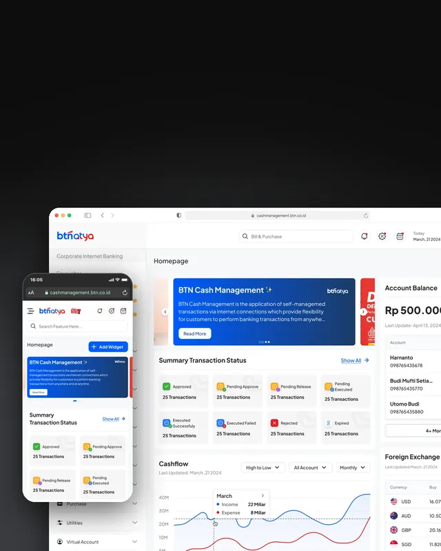
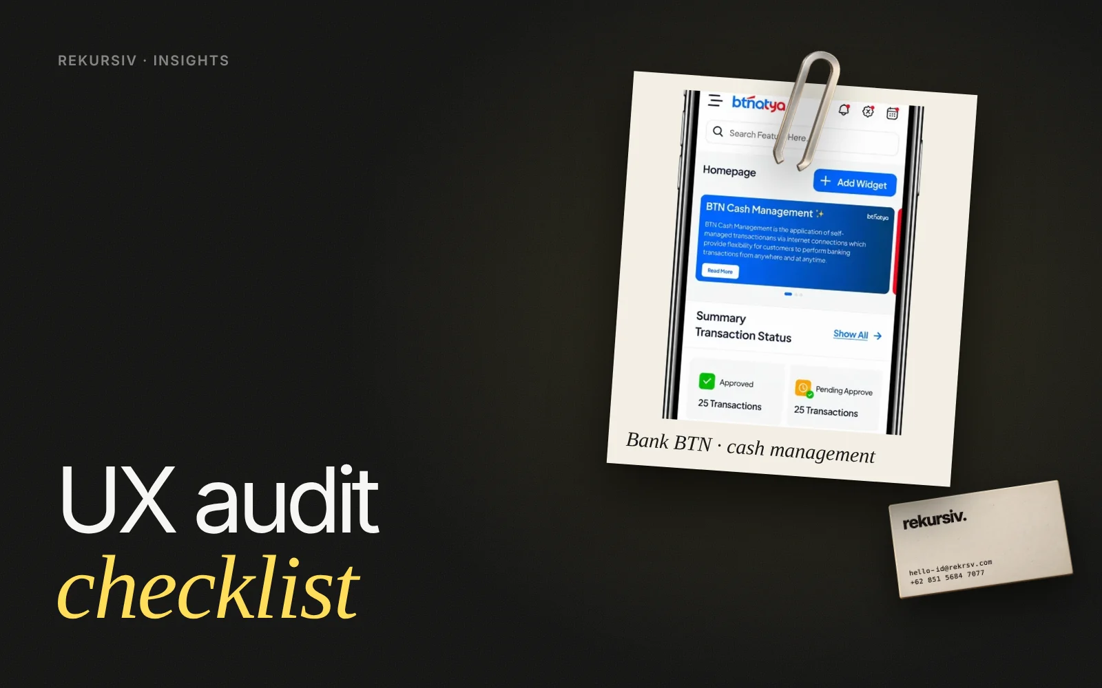
For Bank BTN's cash management system, an outdated interface used daily by corporate clients, we started with a heuristic evaluation of the existing screens, then ran usability testing with 10 participants and grouped what we heard with affinity mapping. Only then did the UX and UI redesign begin, so the new system looked modern without confusing the clients who already relied on it.
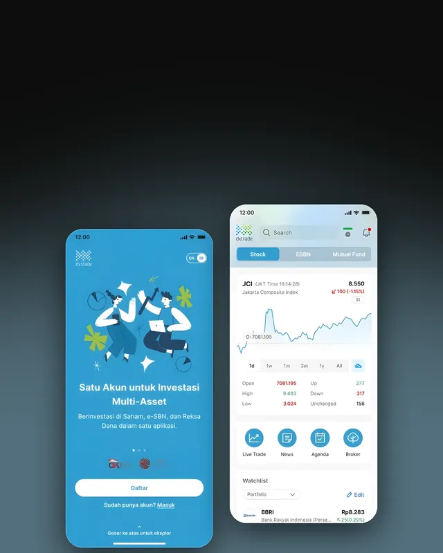
For Bahana Sekuritas, the DXTrade trading app had not had a major update in years. User research and insights shaped a redesign that delivered 62% faster registration, 92% faster product finding and a time to purchase of under 18 seconds, with 8+ new features.
How to Start
- Pick the journeys that matter most to your business.
- Gather your analytics so you know where users drop off.
- Run a heuristic evaluation on those journeys and score the issues.
- Confirm the top issues with a small usability test before you redesign.
Want an outside review of your app or website? Talk to us.
Frequently Asked Questions
What is a UX audit?
A UX audit is a structured expert review of a website or app that checks each screen and key journey against proven usability principles, such as Nielsen's 10 heuristics, and lists the issues ranked by severity with recommendations.
What is the difference between a UX audit and usability testing?
A UX audit is done by experts reviewing the product. Usability testing watches real users try tasks. An audit is faster and finds many issues; testing confirms which ones actually stop people. The best results combine both.
What should a UX audit checklist include?
The 10 usability heuristics, your most important user journeys, forms and error states, navigation and search, content clarity, mobile behaviour, accessibility basics and analytics where drop-offs happen.
How long does a UX audit take?
It depends on the number of screens and journeys. A focused audit of a few core flows is much quicker than a full product review; scope it around the journeys that matter most to the business.
When should you run a UX audit?
Before a redesign, when conversion or engagement drops, after many small feature releases have piled up, or when you inherit a product and need a clear list of what to fix first.
Sources
Project figures from rekursiv case studies
- BTN Cash Management System Bank BTN
- Revitalizing a stock trading app Bahana Sekuritas