What Is a Design System? Components, Examples and How to Build One
What a design system is, what it contains, how it differs from a style guide and UI kit, and how to start one for your app, website or dashboard.
In this article
A design system is a shared set of design rules, reusable components and documentation that designers and developers both use to build a digital product. Instead of redrawing a button or a form on every screen, the team picks it from one library, so the app, website and dashboard look and behave the same everywhere, and new features ship faster.
See our UI/UX design service.
What Is a Design System?
A design system is the single source of truth for how a product looks, reads and works. It sits between brand and code: the brand defines the personality, the design system turns it into concrete rules and components, and developers build from those same components.
The key word is shared. A Figma file that only designers open is a starting point. A design system is used by design, product and engineering together, and someone owns it.
What a Design System Contains
| Part | What it holds |
|---|---|
| Design tokens | Colours, typography, spacing, radius, shadows, defined once as named values |
| Component library | Buttons, inputs, cards, tabs, modals, in Figma and in code, with every state |
| Patterns | Ready-made solutions for repeated flows: forms, onboarding, search, empty states, errors |
| Content guidelines | Tone of voice, labels, error messages, number and date formats |
| Accessibility rules | Contrast, touch target size, focus order, text alternatives |
| Documentation | When to use each part, when not to, and examples |
| Governance | Who owns it, how changes are proposed, reviewed and released |
Design System vs Style Guide vs UI Kit
These terms are often mixed up:
- Style guide: describes the visual brand, such as logo, colours and fonts. Useful, but it does not tell anyone how a date picker should behave.
- UI kit: a set of design files with components. It speeds up design, but developers still rebuild everything in code.
- Design system: includes both, plus coded components, usage rules and a process to keep design and code in sync.
Why It Matters
- Consistency: users learn a pattern once and recognise it everywhere in the product.
- Speed: new screens are assembled from tested components instead of designed from zero.
- Quality: accessibility and edge cases are solved once, inside the component.
- Easier handover: developers receive components that match the code, not only pictures of screens.
- Scale: new designers, developers or vendors can contribute without breaking the experience.
Where It Pays Off: Apps That Keep Growing
A design system earns its keep in products that keep adding features. Two finance apps from our work show the kind of growth that needs shared rules:
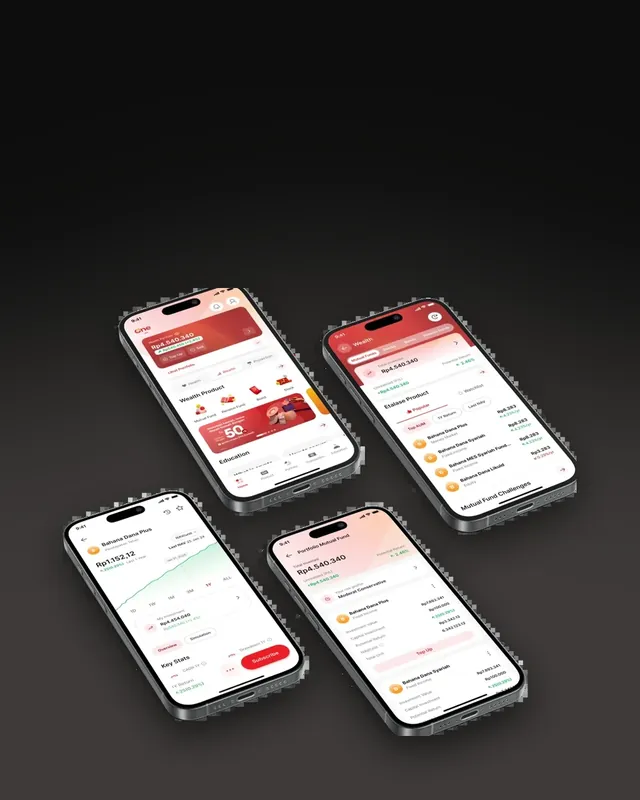
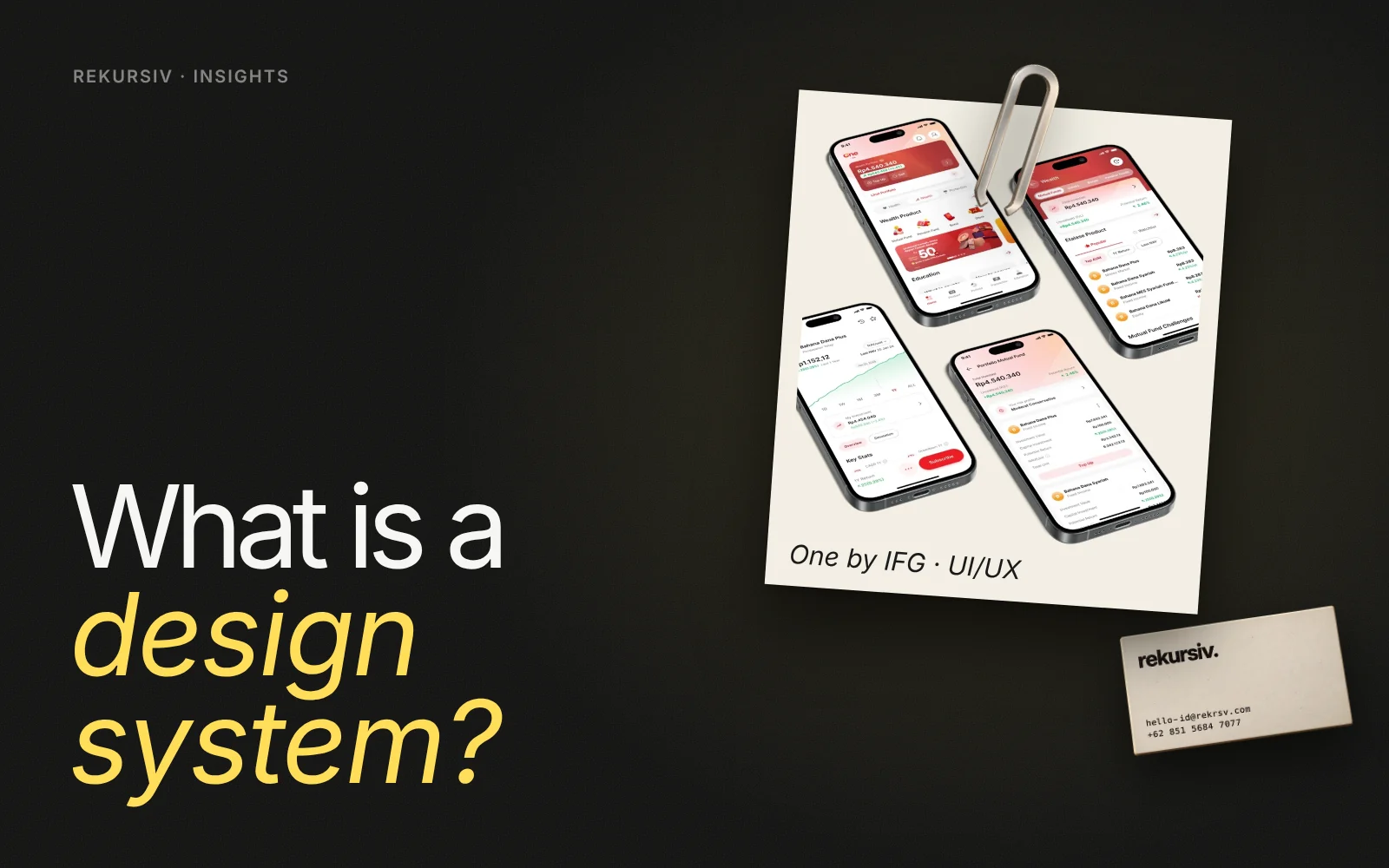
- One by IFG puts insurance, mutual funds, bonds and stocks in one app. Before launch we ran in-depth interviews and usability testing with 15 users. The app reached 75K users in 8 months, with +6 unique features and a 4.9 app rating.
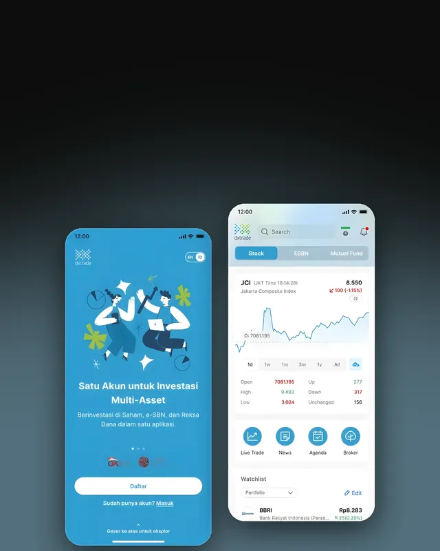
- Bahana Sekuritas DXTrade was redesigned as a modern multi-asset investment app with 8+ new features. Registration became 62% faster, finding a product 92% faster, and time to purchase dropped below 18 seconds.
These results come from research, experience design and UI design together, not from a component library alone. But the more products and features sit in one app, the more every new screen depends on consistent rules so it still feels like the same product.
Do You Need One Yet?
You probably do if:
- More than one team or vendor designs or builds the same product.
- You have several products or platforms (iOS, Android, web, internal dashboard) that should feel related.
- The roadmap adds features every month.
- Designers and developers keep rebuilding the same elements, or screens drift apart over time.
A small company website with a handful of pages usually needs a solid style guide and a few components, not a full system.
How to Start a Design System
- Audit what exists. Screenshot every button, input and card in the product. The inconsistencies show you where to start.
- Define tokens. Agree on colours, type scale and spacing as named values.
- Build the most-used components first. Buttons, inputs, navigation and cards cover most screens.
- Match design and code. Use the same names and states in Figma and in the front-end library.
- Document as you go. Short usage notes beat a long manual nobody reads.
- Assign an owner. Decide who reviews changes and how often new versions are released.
- Grow it with real features. Add components when a product need appears, not in advance.
How to Start
If you are planning a new app or redesigning one, ask for the design system to be part of the scope and handover, so your team owns the components, tokens and documentation. Want help researching, designing and documenting yours? Talk to us.
Frequently Asked Questions
What is a design system?
A design system is a shared library of design rules, reusable components and documentation that designers and developers use to build a digital product. It keeps colours, typography, spacing, buttons, forms and patterns consistent across every screen and platform.
What does a design system contain?
Usually design tokens (colours, type, spacing, radius), a component library in Figma and in code, patterns for common flows such as forms or onboarding, content and accessibility guidelines, and documentation that explains when and how to use each part.
What is the difference between a design system, a style guide and a UI kit?
A style guide describes the visual brand. A UI kit is a set of design files with components. A design system includes both, plus coded components, usage rules, governance and a process for updating it.
When does a company need a design system?
When more than one team or product shares the same interface, when the product keeps adding features, or when designers and developers spend time rebuilding the same elements. A small website with a few pages rarely needs a full system.
How long does it take to build a design system?
A first version that covers the most-used components can be ready within a few weeks alongside product work. A design system is never finished: it grows with the product and needs an owner to keep it up to date.
Sources
Project figures from rekursiv case studies
- One by IFG, an all-in-one finance app IFG
- Revitalizing a stock trading app Bahana Sekuritas